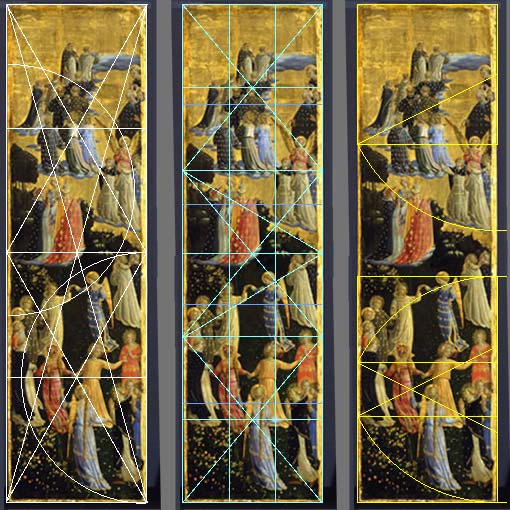
One of my favorite paintings was The Last Judgment: Paradise, (1435-40, Tempera on panel, 40-1/2 x 11-1/8 in.) The painting is a difficult size 40.5 x 11 inches or 3.6 to 1 height to width ratio. Tall and skinny might not be so bad for an abstract painting or one with just a single image but "Paradise" has 32 figures in it. I was talking with a couple from Philadelphia about the composition, about how geometrically structured it looked. Yesterday, still curious about this, I took a closer look and made a diagram of the composition.

Legend:
Left: The panels height is divided by 1/2 and 1/4 and the diagonals.
Mid: The cyan lines are the 1/3-2/6 divisions and the diagonals.
The blue lines are the 1/5 divisions.
Right: The yellow lines are squares with the height equal to the panels width.
The arcs are a method used to geometrically construct the golden section (1.618)
I found the paintings surprisingly modern looking, Pope Pop.

No comments:
Post a Comment